Photography Tips

Blog posts by harumi


I listed my blog posts here linked below. Hope you enjoy them.

Photography editing tips

Life moments with photos

Flower Walk Series

Creative hack (Tips on the creatives)

Art + Craft (Tips and instruction)

Music


How to do styling for flat-lay still life photography by harumi

 
kore8.jpg
 

Flat-lay. Yes, I love flat-lay photography. It’ because the style gives me a lot of creative freedom, and I can do anything with goods to make something appealing through photographs.

I used to say, “I don’t know, just go with the flow.“, Not considering repeat and the process of creating. But does it really say “creative“?? If I cannot vocalize how the process of my creativity pops out.

So today, after thinking about my process of creating flat-lay, and how I got to this point, where the final image comes out, I am going to leave 3 tips for flat-lay photography for people who are interested in collage, photography, or styling.

Hope you get something, some ideas from this post.


1. Get everything connected

Pick the main item for your theme. Bring related things that could get along with the main item.

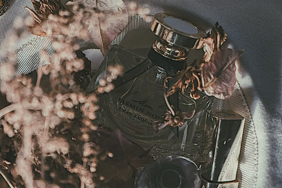
For example, Theme: feminine, aesthetic beauty/softness > female symbolic item > perfume (the main thing)

Perfume > fashion > Coco Channel > the 20s hat

Perfume > cosmetics > lip sticks

Perfume > sophisticated > modern stylish > Tech > Apple > MacBook (lucky my MacBook cover is pinky marble)

Perfume > gorgeous > flowers > roses

1. Pick up one main item > Perfume

1. Pick up one main item > Perfume

2. Add the main supportive item > the other perfumes.

2. Add the main supportive item > the other perfumes.

3. Add cosmetics.

3. Add cosmetics.

4. Add the victorian hat roses, and a Macbook.

4. Add the victorian hat roses, and a Macbook.

5. add vintage jewelries.

5. add vintage jewelries.

6. Done

6. Done


2. Practice your imagination with words

In tip#1, “get everything connected,“ it’s about what you connect similar interests into all the same categories. But to do so, you might need to practice to come up with a connection of words. Imagination and creation to unify and gather all things together. Play with words.

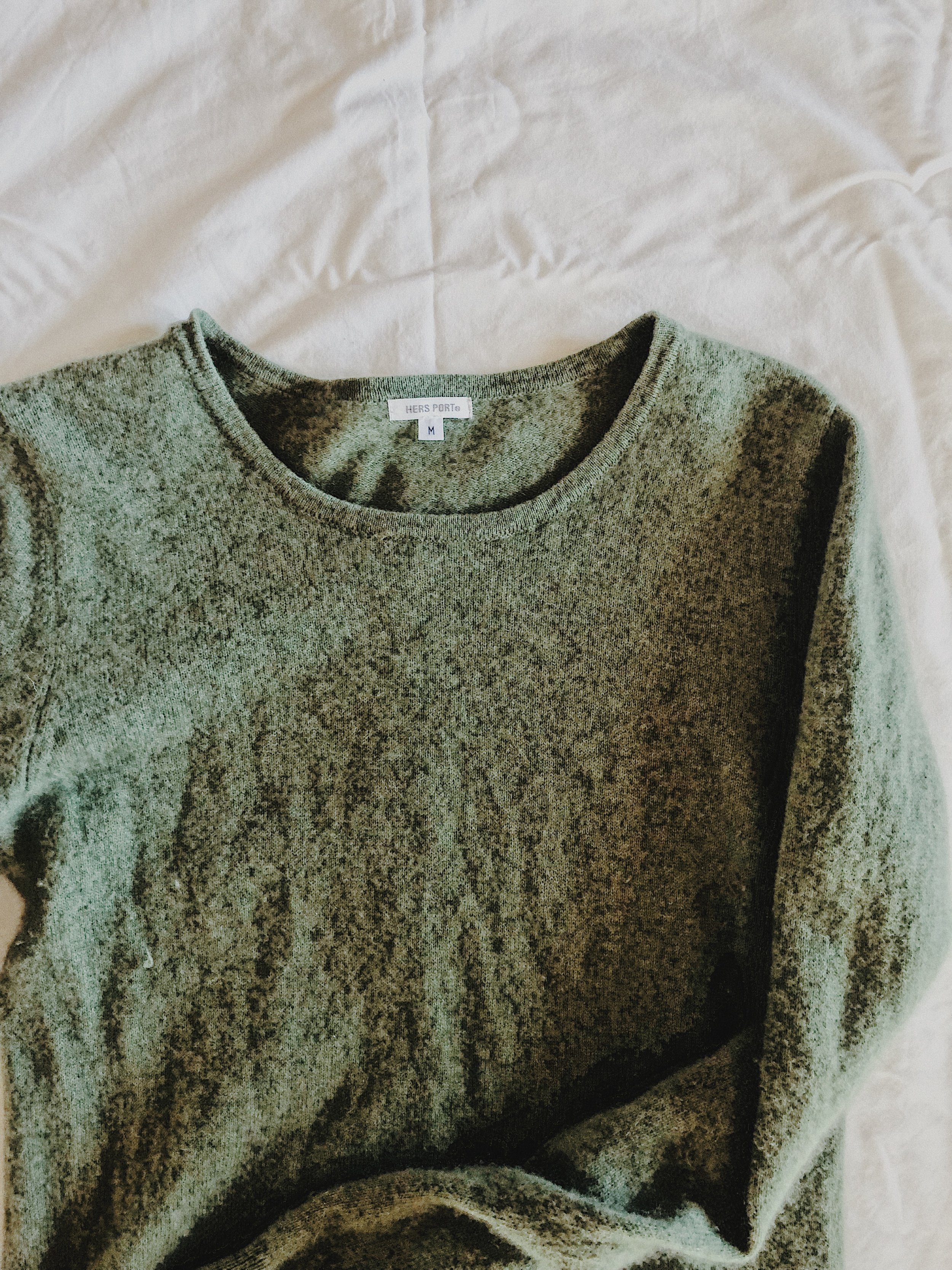
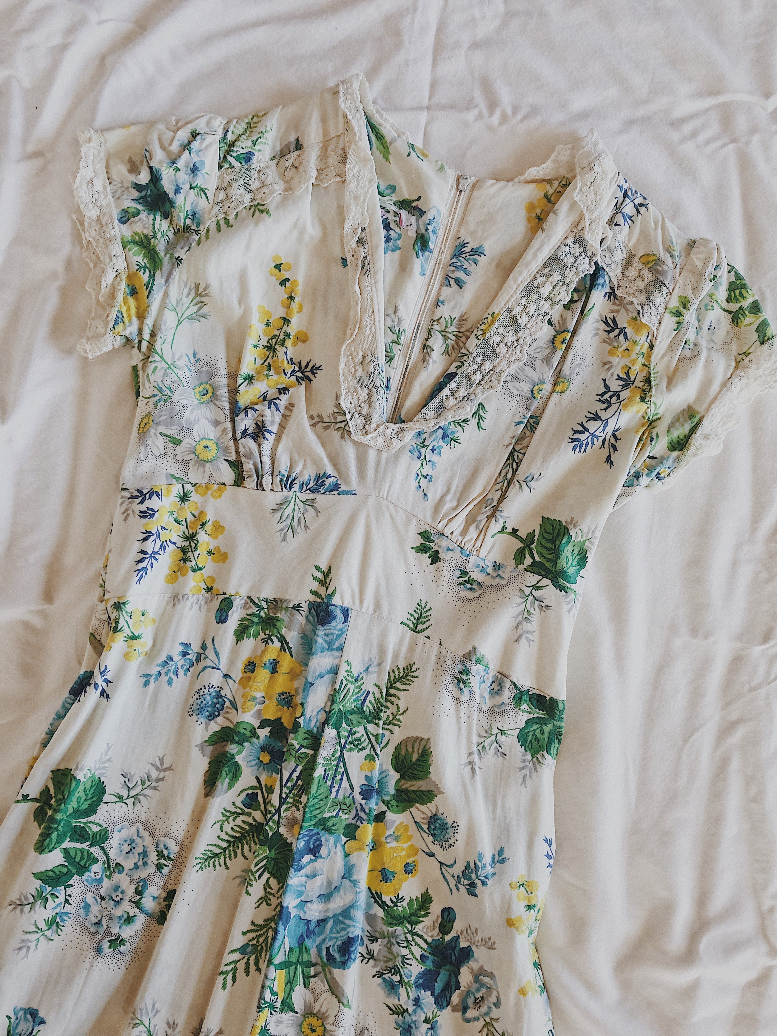
To practice imagination and creation, I recommend doing “color styling.“ Color styling is that you name colors of clothing as if you were a stylist for some clothing brand. Think about what words you can use to describe a dress to get consumers to know about the dress, and how you can present its attraction

Here are my examples by using my closet.

 
Rose-hip combo

Rose-hip combo

Strawberry cream macaron

Strawberry cream macaron

Lavender pink

Lavender pink

Dahlia paradice pink

Dahlia paradice pink

Jane Birkin

Jane Birkin

 
Summer dreaming

Summer dreaming

80s disco queen

80s disco queen

Kale mix

Kale mix

Indian summer green

Indian summer green

Dark Green tea latte

Dark Green tea latte

Moss forest light green

Moss forest light green

Lily’s memories

Lily’s memories

 
Hawaiian muse

Hawaiian muse

Chinese chamomile yellow

Chinese chamomile yellow

British autumn garden

British autumn garden

Balinese Jasmine

Balinese Jasmine

Edna in New York

Edna in New York


3. Input words and make captions for scenes

To practice imagination by naming colors of clothing, you might want to input words giving your creativity in your daily life.

Here what I do.

You take notes something you eat, hear, or see in food, tea, sweets, etc.., leave colors as an adjective to describe things that come up in your mind.

For example,

If I had a chamomile tea before bed, I would leave a note,
white-yellow chamomile tea brings me a calm night.“

If I had a banana pancake for breakfast, I would leave a note,
“a delicious brown banana pancake with Canadian golden maple syrup.“

If I see mints growing up at the balcony, I would leave a note,
“a dessert for tonight would be green-green mint chocolate chip vanilla ice cream? Or minty flavor sorbet? or pinky peach cobbler with mint and white-cream on the side?“

If I hear birds singing outside, I leave a note,
“hummingbirds singing for bright pink cherry blossom and moss-green leaves coming after.“


Practice.

Those are photos and drawings of mine. How do you make captions for them paralleled with colors and words?


Hope that you enjoyed and had new inspirations for your creativity.

See you in the next post.

More photos on Pinterest, Facebook, and Instagram.

Pinterst: https://www.pinterest.jp/harumiphotography

Facebook: https://www.facebook.com/harumiphotography

Instagram: https://www.instagram.com/harumi.photography

Behind the Scene -How I get an inspiration for fashion editorial photography- by harumi


To come to this point, where images for a fashion editorial, there is a process of creating images in our way of putting out the original creativity. Here, I’m going to leave little tips on getting inspiration to make your images for fashion editorial from my recent shooting.

1. Gathering images that catch your eyes on Pinterest

Pinterest is a crowd of ideas for photography. The platform gives us tips of your creativity, not only for life routines but for photography and styling work. Yes, there are critics that we see the same images on the platform every day and losing the authenticity of creation. However, I still believe in Pinterest, giving me a chance to get inspired and define my taste. Also, that allows me to show my work to the public.

For my photography boards, go to my page, and hope images I've pined gives your inspiration freedom.

Pinterst: https://www.pinterest.jp/harumiphotography


2. Checking catalogs of brands that fit your style

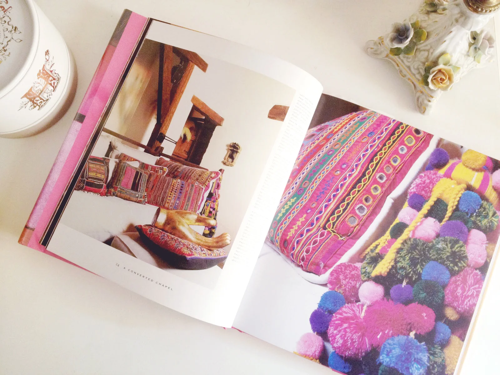
I correct catalogs and look-books, mostly clothing brands, furniture stores, or just other fashion editorials.

These really help me form my taste, and any time I have difficulty with deciding a taste for the next images, those catalogs from professional stylists, photographers, editors..etc.., resonate with me so much.


3. Gathering clothing, fabric, and accessories I’d like to use for an image

Finally, after gathering images on Pinterest and getting inspired from other catalogs, I pick dresses and accessories from my apartment and see how I can get my creatives to be visible, making things in my head real.

I think this is a vital part of creating your own images. You see what taste you are getting attracted to usually, and even you’re unconscious about what you have, this time tells you that which styles and objects you pay attention and put a value on.

Although I don’t wear the Victorian style in a daily scene (secretly, want to), if I find an antique dress or jewelries, just buy them and keep those in my dresser. So that if any occasion comes to me, shooting, those are my business tools to make my work the best outcome.


So those are my creative process of getting inspiration for fashion editorial photography and how I organize my thoughts to make things happen for real.

Hope those help you find your way of creatives and thank you so much for reading : )

How to take food photos outside by harumi

Retouched

Retouched

The original photo Shutter Speed 1/10, F 3.5, ISO 800at Chatan Harbor Brewery

The original photo
Shutter Speed 1/10, F 3.5, ISO 800

at Chatan Harbor Brewery

 
Retouched

Retouched

The original photo Shutter Speed 1/10, F 3.5, ISO 600at Chatan Harbor Brewery

The original photo
Shutter Speed 1/10, F 3.5, ISO 600

at Chatan Harbor Brewery


For the last of series posts, "How to take/edit food photography," I would like to go present with the way of showing before and after photos. I leave both the original photo and retouched one worked on LR and see how it gets done to finalize photo editing. Here, let me go through 3 tips of taking food photos outside.

Previous series posts
#1:
How to take food photos at home (Dark Moody Look)
#2:
How to take food photos at home (Whitish-blight look)


  1. Set shutter speed and ISO right
    It's so important to keep your attention to shutter speed and ISO on your camera. I know I edit photos later, and I could just focus on shooting. BUT I do not want to think "I can edit it later." So try to set up the shutter speed, and ISO proper to light up for an environment. It's a restaurant. There is no any way to set up flash-light next to food, and you don't want to bother other customers by flashing. Also, you better enjoy your quality time, which is eating(!). You quickly need to take shots before meals get cold. Setting up the proper shutter speed and ISO before the food is delivered, and when it comes to your table, you are ready to shoot.

  2. Add colors on food by color luminance tools
    As showing my editing process on color luminance tool in a screenshot below, you get to know and focus what food should be featured. In this photo, apparently, chops. First, I adjusted "Red." After having the best color on the chops, I modified other colors to fit the tone of the chops over the whole meal presentation on the plate.

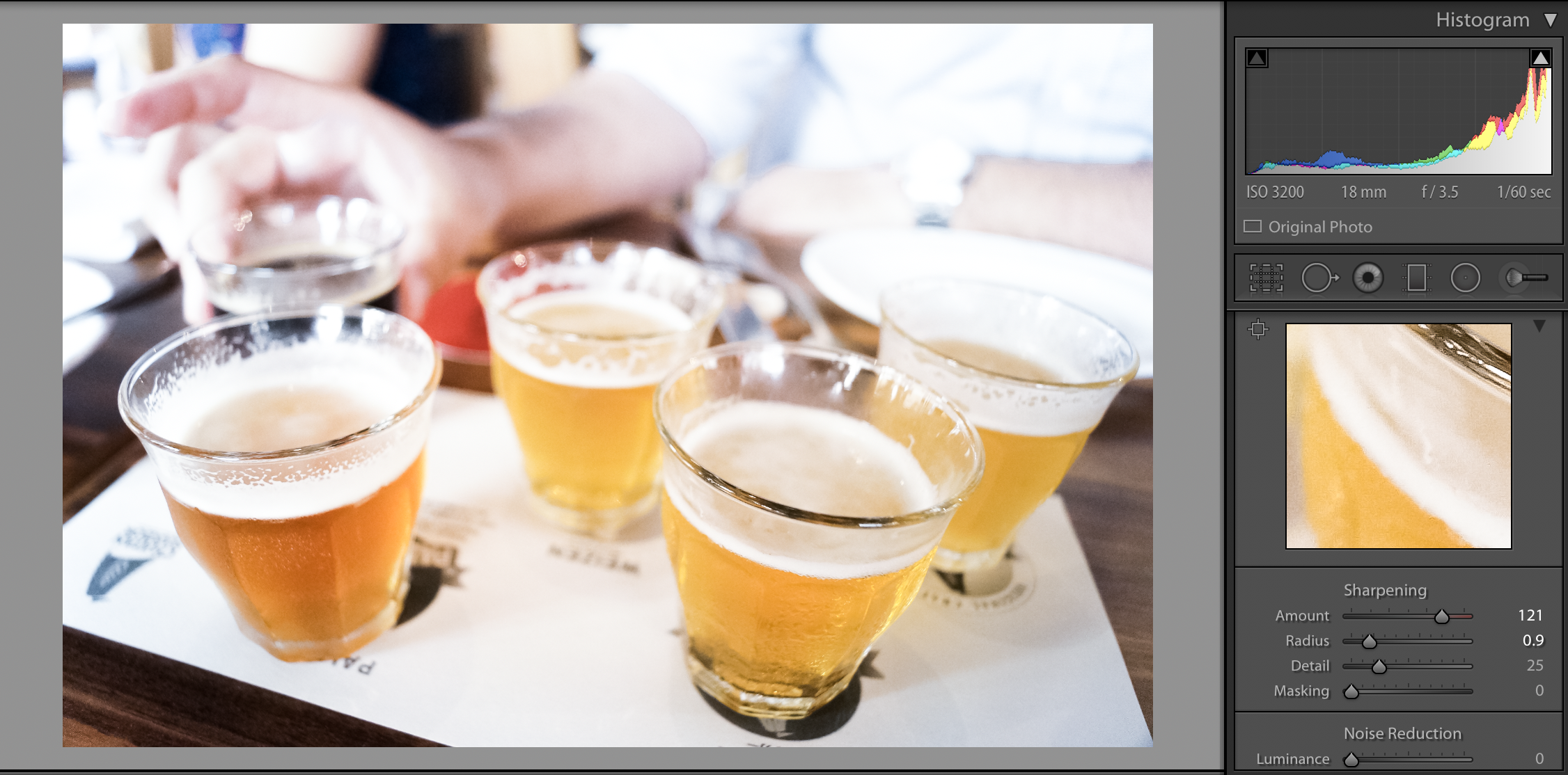
  3. Give the high amount of Sharpening as much as possible
    One more screenshot of editing behind the scene. Especially when it comes to beers, top bubble surface and the golden color of liquid that makes you gulp it should be emphasized on a photo. Adding the high amount of Sharpening gets it next level of food photo presentation to make audiences craving it.

#2 Tip: “Add colors on food by color luminance tools”

#2 Tip: “Add colors on food by color luminance tools”

#3 Tip: “Give the high amount of Sharpening as much as possible”

#3 Tip: “Give the high amount of Sharpening as much as possible”


Taking a food photo by your phone

Next. I would like to show how to take food photos by an iPhone. For the picture below, I use Snapseed to edit.

I like Snapseed because it has all adjustment tools it needs and is able to edit the whole parts on the phone. The app particularly provides excellent work for food photography. (I have used different apps, but this probably the best-qualified app concerning editing quality, control, and modification. )

The original at Full Circle

The original
at Full Circle

Retouched

Retouched


It's a slight change of brightness of the table, details of food, and contrast, however, that's a crucial part of photo editing, I think. This descent effort keeps you up with the pursuit of beauties on photos, such as better qualities, details, and brightness, that gives shiny parts of food presented in your quality time.


I think that’s it for the series of taking food photos. :) Hope you enjoyed and earned a little tips from the posts.

Thank you so much for reading.

How to take food photos at home (Whitish-blight look) by harumi


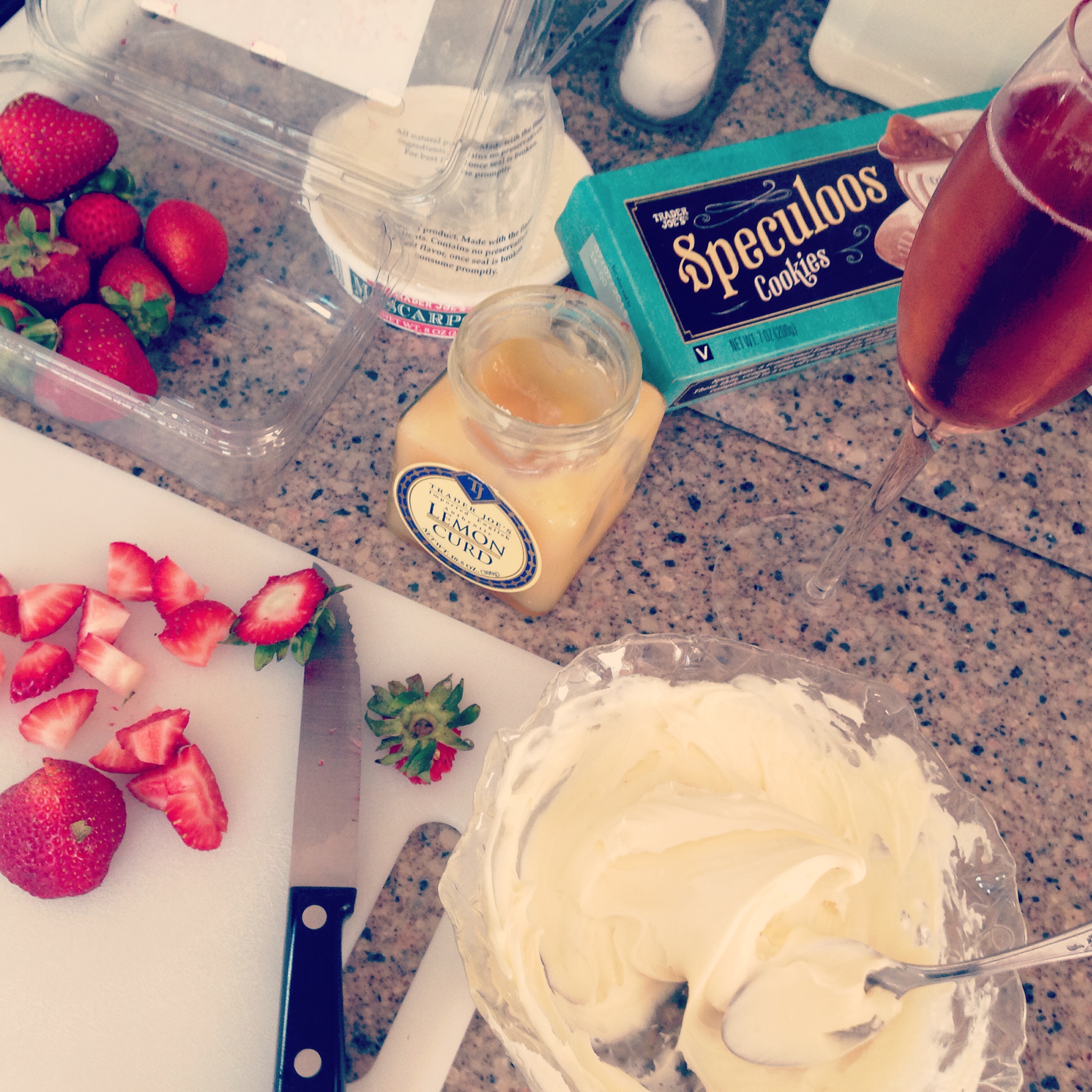
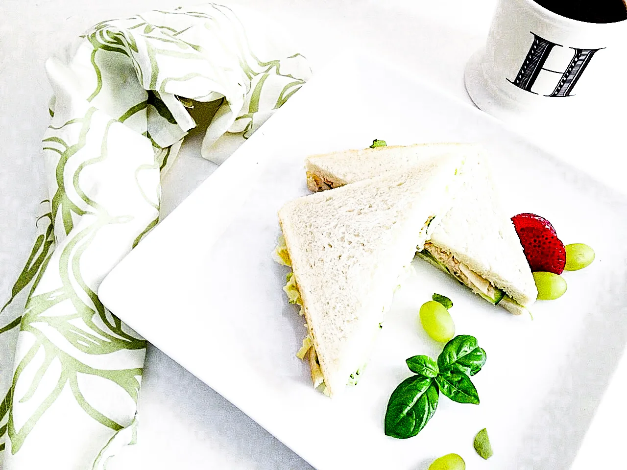
This is for the series of taking food photos from the previous post. The series continues to the last post, "taking food photos outside." Today, I present "How to take a food photo at home (bright-light look)."

Those are photos from the time I started using a DSLR camera back in 2010-11. (Resolutions are not high because I did not know how to control that camera.)

In the previous post, I was talking about editing points that sum up photo qualities. Today, I give a little tip on editing for a bright light look.


Let me quickly show tips on taking food photos at home and make it bright-light look with tips of 1. Use a white dish, table or put a white table-cross, 2. Control levels, 3. Make it in high contrast with colors.


  1. Use a white dish, table or put a white table-cross

    It's before editing, at time of the shooting. To use a natural light wisely, a white base under dishes really helps to edit later. I usually use a white table or white plates for shooting. If not, buy at least A3 size of white papers, and that helps to reflect natural lights and brightness adjustment on LR/Photoshop.


  2. Control levels.
    The bright look is all about brightness over the whole photo. On photoshop, you open levels and move the right point to left. That creates more shining light over the picture, however, keep your mind that brightness does not color off on the main food.


  3. Make it in high contrast with colors

    Because of the other whiteness around food, now you can use high contrast and add colors onto food for more visually popping out. In the previous post, one of the tips were for the basic of color luminance. In addition to the point, high-contrast with colors really works out for the whitish-blight look, and to make the adjustment tool is handy, food choice for the primary photo object, the colorful fruits, such as grapes, strawberries, berries, peach, etc.., are the best ones to use to practice high contrast with colors in whitish-blight look. Those fruits are visually great when they are mature enough to eat. (It means the mature high contrast colors on the surface) as compared with other “side-fruits," such as figs, persimmons, green apples, etc.. 


In the end, it's all about your preference and perspectives for what could be matching with whitish-blight look or dark-moody look in food photography.

Enjoy shooting photos at home. :)